
SBR 61: How to Make Your Packaging Work Harder
Walk down any supermarket aisle and you’ll see it: a visual battlefield of brands, all fighting to be picked in seconds. In this context, every millimetre on a pack is prime real estate.
Packaging isn’t just about standing out. It’s about helping people decide. Fast. And that means every word, symbol, and graphic needs to pull its weight. If it doesn’t drive choice, it doesn’t deserve the space.
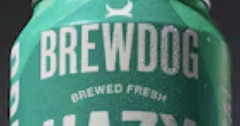
Take BrewDog’s latest redesign. Their new cans feature a “Brewed Fresh” lock-up. Nice sentiment – but what does it actually do? Does it say anything the consumer doesn’t already assume? Does it change the decision in front of the shelf?
Probably not.
Having worked on plenty of “postage stamp” labels in my time (milk being the worst offender), I’ve learned a few key lessons about what earns a place on pack – and what’s just clutter.
1. As much as needed, as little as possible: Less is almost always more. White space isn’t wasted space – it’s what makes the rest of your message legible and confident. If your pack’s full, your value gets lost.
2. If the opposite isn’t true, don’t say it: Would anyone ever write “Brewed Stale” on a can? If not, “Brewed Fresh” probably isn’t telling us anything new. Messaging should make a point – not state the obvious.
3. Use pack copy to do a job: Good packaging copy does one of three things:
Decodes complexity: e.g., “Nitro-infused” explains the Guinness widget.
Delivers proof: e.g., “100% recycled aluminium” supports eco-conscious choices.
Creates a memory hook: e.g., “Shake the bottle, wake the drink” turns instructions into brand assets.
If a word, logo or icon isn’t helping shoppers understand, believe, or remember – take it off.
Because shelf space is hard enough to win. Don’t waste your packaging with messaging that doesn’t work just as hard.