
BIG
BLACK
DOOR
This web page contains everything you need to make BBD assets look and sound like BBD. This guide is built to reduce decision-making, keep the work sharp and make decks, proposals and outreach feel unmistakably consistent.
BBD exists to bring clarity before creative. The role is not to add noise, chase fashionable tactics or dress weak thinking up as strategy. The role is to help marketing leaders see the problem clearly, make better decisions and brief the right work.
The brand should feel confident, direct, warm and commercially grounded. Never flashy for its own sake. Never corporate for comfort. The work should look considered, speak plainly and feel like it came from people who know what good looks like.
Every asset should feel like a useful working document, not a generic agency presentation.
Clarity comes first. Design should sharpen the point, not compete with it.
When in doubt, strip things back. Less noise, fewer colours, fewer words, stronger judgment.
COLOUR SYSTEM
The palette is deliberately tight. Black is the default base. Amber is the core highlight. Section colours are used with intent, not decoration. In slide decks, colour change should signal a shift in meaning.
CORE COLOURS
The palette is deliberately tight. Black is the default base. Amber is the core highlight. Section colours are used with intent, not decoration. In slide decks, colour change should signal a shift in meaning.
Warm Black (#0A0A0A)
Default background for proposals, decks and most branded assets.
Burgundy (#4a0e1e)
Problem, tension and challenge. Use when diagnosing what’s stuck.
Off-White (#f5f4f0)
Primary light text. Warm, soft and less harsh than pure white.
Teal (#00857a)
Solutions, recommendation and next steps.
Amber (#FFBB08)
Main highlight colour for labels, key words and selective emphasis.
PRESENTATION SECTION COLOURS
These colours are used to signal a change in section or mood inside a deck. They are not interchangeable. Each one carries a job.
Purple (#5b3fa0)
Workshop, research or learning sections.
Amber (#FFBB08)
For all other sections. Be mindful to change type to high contrast
TYPE SYSTEM
The type system does two jobs. Anton brings impact and confidence at headline level. Trebuchet MS keeps body copy readable, direct and unfussy.
CLARITY
BEFORE
CREATIVE
Before refreshing the brand, we need to make sure you are solving the real growth problem: visibility and meaning in the moment of choice.
Hero / slide title
Anton 40pt
Always all caps
Leading: about 0.92
Used for covers, key section dividers and high-impact arguments. Display titles should be all-caps Anton. That’s part of the BBD look.
OUR APPROACH
Section header
Anton 40pt
Always all caps
Leading: about 0.92
Used for internal headings and chapter markers.
Body copy
Trebuchet 20pt
Sentence case
Leading: about 1.65
Used for slide body copy, proposal text and working documents. Use Trebuchet MS at regular weight for body copy. Do not rely on bold for emphasis when spacing, line breaks or colour will do the job better.
Do not use Calibri, Arial or generic system fonts in branded output.
LOGO
The BBD logo should feel like a quiet signature, not a centrepiece. In most decks it sits small in the bottom-right, there to mark ownership rather than shout for attention.
On black (preferred)

On off white (secondary)
Use the official logo asset in final documents whenever possible. In slides, keep the logo small and quiet, usually bottom-right. Use the light logo on dark backgrounds and the dark logo on light backgrounds. Do not place the logo large and central unless the entire slide is functioning as a cover.
THERES A
STRUCTURE
TO OUR
PRESENTATIONS
BBD’s presentation style should feel sharp, confident, and stripped back. At its best, it looks like this:
Minimal words. Strong point of view: Each slide earns its place. No wall-of-text consultancy filler. The copy is tight, commercially focused, and easy to scan. The deck should feel like it was built by people who know what matters and have cut everything else.
The cover slide is simple: Wherever possible, a white client logo next to our preferred logo on a black background (see example below).
Centrally aligned and visually calm: The layout should feel deliberate rather than busy. Strong headline-led slides. Plenty of space. Center alignment works well because it gives the deck a composed, confident feel — especially when paired with bold type and disciplined spacing.
Early narrative summary before the detail: The first couple of slides should usually include a short summary paragraph, around 50–75 words, that reflects the conversation we’ve had with the client or prospect. That paragraph should do two jobs: (i) show we’ve understood their situation; (ii) set up the problem that the next section will unpack.
Problem first, not services first: The early slides should frame the commercial or marketing challenge clearly before moving to solutions. That makes the deck feel strategic rather than salesy. It also reinforces that BBD starts with clarity and diagnosis, not a pre-baked answer.
Solution focused: Once the problem is clear, the deck should move into how BBD would approach solving it: practical thinking, smart thought starters, initial observations on the brand or market, and a simple view of where momentum could come from. This should feel like useful senior input, not generic agency “ideas”.
A process that creates confidence: The process section should be simple and credible. Not ten-step consultancy nonsense. Just a clear explanation of how BBD works through the problem, creates clarity, and helps the client move forward. The process should make the work feel structured without making it feel bureaucratic.
Pricing shown simply: Gold / Silver / Bronze should be presented clearly, with enough detail to help decision-making but not so much clutter that it becomes a spreadsheet. The tone here should be straightforward and self-assured: different levels of support, different depths of involvement, same strategic quality. The difference between the levels should be about the level of risk / research rather than the quality of thinking.
Creds the end: The creds slides and team slides should come later. That keeps the deck focused on the client first. By the time we get to credentials, the audience should already believe the thinking is strong. The creds then reinforce that belief rather than trying to substitute for it.
Overall tone is grown-up and commercially useful: It should never feel fluffy, loud, or overworked. It should feel like senior marketers speaking to senior marketers. Clean. Focused. Helpful. Confident. A bit of edge, but never showy.
A sample BBD deck flow would be:
Cover
Summary of what we’ve heard
Framing the problem
What’s really getting in the way
How we’d approach solving it
Thought starters / early opportunities
Our process
Pricing: Gold / Silver / Bronze
Relevant credentials
About BBD / team
imagery
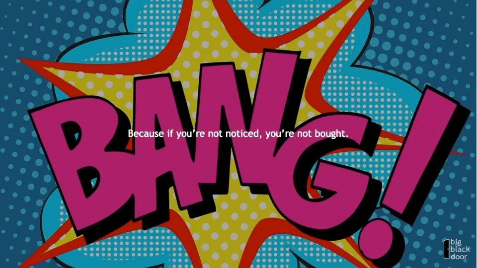
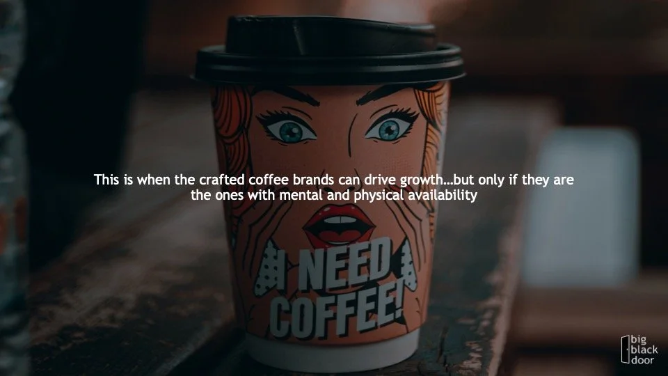
Use quirky images to illustrate our points. The images aren’t literal, they’re slightly amusing and tangental. When we use images, they’re full bleed with copy placed centrally over the top. If it’s needed, set the image transparency to c25% against a black background to make white copy stand out better. The preferred logo is then applied on top, in the bottom right corner of the presentation.
SOME EXAMPLES


FINAL POLISH
File named correctly: YYYYMMDD_ClientName_x_BBD_ProjectType.pptx