
SBR 70: Why Heineken’s Tube Signage CutS Through
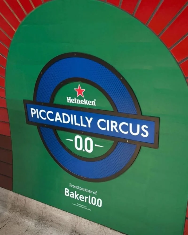
There’s been understandable debate about Heineken’s decision to alter London Underground signage as part of its media idea.
The core concern is accessibility. Any change to a system people rely on for navigation, especially passengers with disabilities, deserves scrutiny. That’s not noise. That’s a legitimate constraint that brands should take seriously. And yes, some elements of the execution feel clunky. Not every adaptation lands cleanly. Not every asset looks elegant when stretched across a network designed for clarity, not creativity.
But step back from the specifics for a moment, and look at the idea through a media lens.
From a pure attention standpoint, this is exactly the kind of integrated thinking that still cuts through. It doesn’t just appear in the environment. It works with the environment. It interrupts routine without relying on volume, shock, or celebrity.
That matters.
Too much out-of-home has become wallpaper. Perfectly compliant and perfectly ignorable. This idea disrupts habit in a way that forces a second look, which is the hardest job media has left.
It’s also a reminder that standout ideas often arrive slightly rough-edged. If you optimise everything for zero risk, you usually optimise away the very thing that makes it noticeable in the first place. And that gives us “meh” work.
None of this excuses poor accessibility decisions. But it’s possible to hold two thoughts at once: execution can be refined, while the underlying idea is still strong. Heineken took a familiar space, treated it as media rather than backdrop, and earned attention without shouting.
That’s harder than it looks. And it’s why, imperfections and all, the idea deserves respect.